
What Are the Elements of Art?
The elements of art are the visual tools artists use to build an artwork. Think of them like the letters of the alphabet. You can’t write a word without letters, and you can’t make a piece of art without these.
Every artwork uses at least one of them, and most use all seven. Here they are at a glance, along with what each one can do to the mood of your art:
| Element | What it is | What it can do to the mood |
|---|---|---|
| Line | A mark that moves from one point to another | Calm (horizontal), energetic (zigzag), graceful (curvy) |
| Shape | A flat, enclosed area with height and width | Orderly and stable (geometric) or natural and relaxed (organic) |
| Form | A 3D object, or the illusion of one, with height, width and depth | Solid, real, something you could pick up |
| Space | The area around, between and within things, plus the illusion of depth | Open and calm, or crowded and tense |
| Value | How light or dark something is | Dramatic (strong contrast) or soft and quiet (low contrast) |
| Color | What we see when light bounces off a surface | Warm colors feel energetic; cool colors feel calm or sad |
| Texture | How a surface feels, or looks like it would feel | Rough feels rugged or tense; smooth feels calm and quiet |
Four Elements in One Painting: The Starry Night
Vincent van Gogh painted The Starry Night in June of 1889 in the south of France. Today it hangs at the Museum of Modern Art in New York, and it’s a great place to see four of the elements in action.
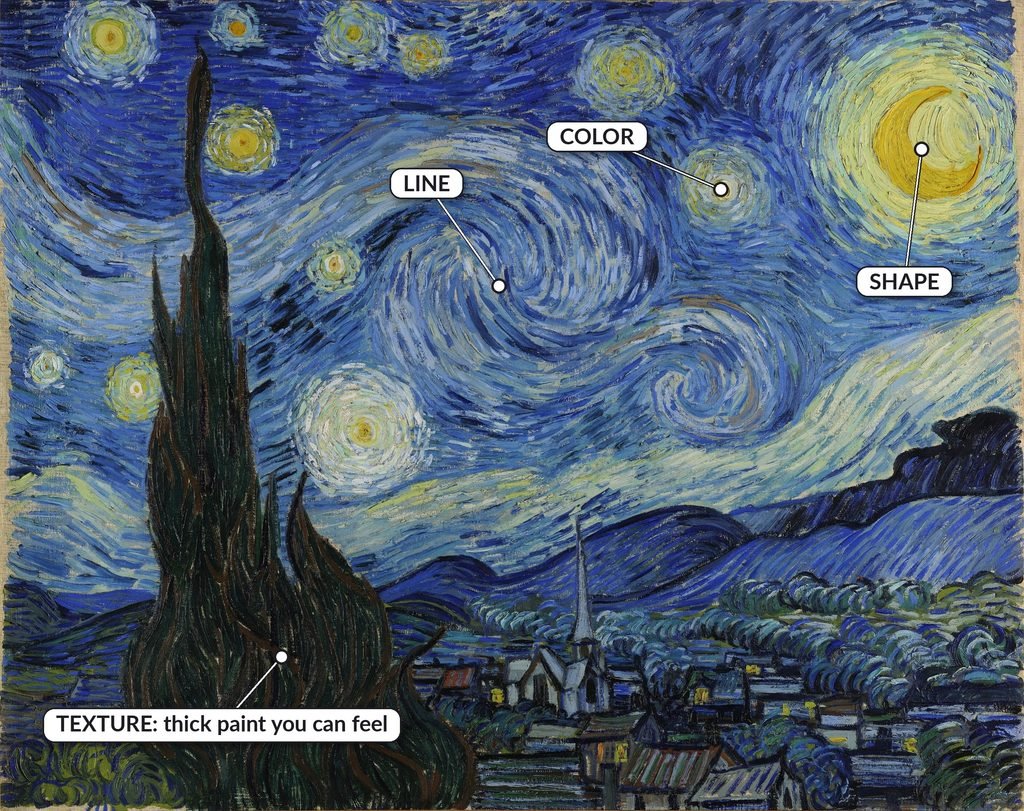
Here’s the quick tour:
- Line: curving, swirling lines roll across the whole sky, while the cypress tree is built from long, flame-like strokes.
- Shape: circles of light around the stars, a crescent moon and the pointed shape of the church steeple.
- Color: blues and yellows, which sit across from each other on the color wheel. That’s why the stars seem to glow.
- Texture: the paint is thick enough in places that you could feel the brushstrokes with your fingers. That’s real texture.
The other elements show up better in other famous works, so each one gets its own painting below: Paul Cézanne’s The Basket of Apples for form and value, and Caspar David Friedrich’s Wanderer above the Sea of Fog for space. And for texture you can see but can’t feel, we’ll look at Albrecht Dürer’s Young Hare.
Line
A line is a mark that moves from one point to another. The artist Paul Klee famously described it as a dot that went for a walk. Lines can be thick, thin, dashed, dotted, curvy, zigzag, straight or broken, and each one sends a different message.
In The Starry Night: the swirling lines in the sky make it feel like it’s moving, even though it’s a still painting.
Mood switch:
[DEMO: two apples side by side. Left: thin, light, even outline. Right: bold outline that gets thicker on the shadow side. Alt text: “Two apple drawings comparing a thin, even outline with a bold, varied outline.”]
Same apple, two different feelings. The thin, even line feels light and a little shy. The bold, varied line feels confident and solid.
Try this (5 minutes): Draw a box and fill it with ten different kinds of lines. Then draw your apple twice: once with one line weight, and once pressing harder on the shadow side and wherever two edges overlap.
Where students get stuck: every line is the same thickness, so the drawing looks flat and stiff. The fix is simple. Press harder on the side that’s in shadow, and let your line get lighter where the light hits.
Go deeper: my video lesson on line.

Interested in using line in your next project? Read this article about Doodle Art for Beginners.
Shape
A shape is a flat, enclosed area with height and width, but no depth. There are two main kinds:
- Geometric shapes are precise and even, like circles, squares and triangles. You’ll find them in things people build.
- Organic shapes are irregular and free-flowing, like leaves, clouds and puddles. You’ll find them in nature.
In The Starry Night: the stars and their glowing halos are circles, and the moon is a crescent. The cypress is one big organic shape that looks almost like a flame.
Mood switch:
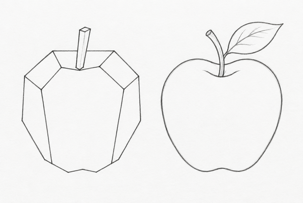
The geometric apple feels stiff, almost robotic. The organic apple feels natural and alive.
Try this (5 minutes): Pick any object in the room. Squint until the details blur, then draw only its outer shape. No details, no shading, just the silhouette.
Where students get stuck: drawing the symbol they “know” instead of the shape they actually see, like a sideways heart for every leaf. Real leaves are almost never heart-shaped! Look at your object more than your paper, and draw what’s really there.
Form
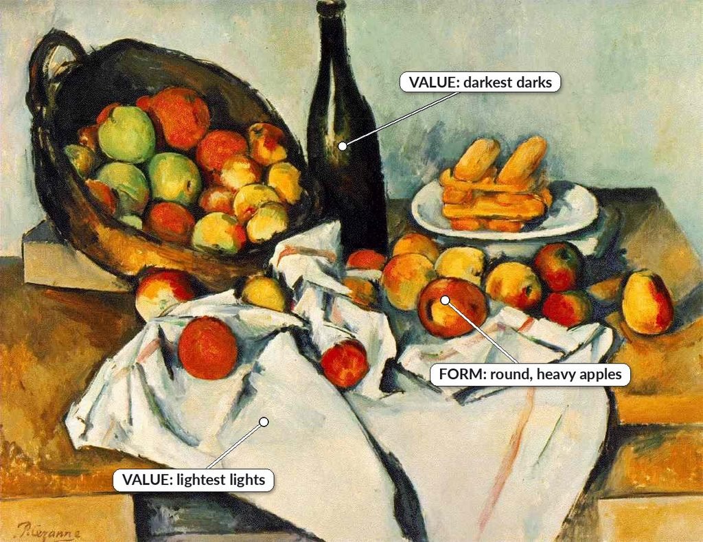
Form is a three-dimensional object with height, width and depth: a cube, sphere, cylinder, cone or pyramid. In sculpture, form is real. You can walk around it. In a drawing or painting, form is an illusion, created with shading and the way your lines wrap around an object.
In The Basket of Apples: Paul Cézanne painted this still life around 1893. Each apple looks round and heavy enough to roll off the table. He didn’t just outline them. He built each one with patches of color that turn from light to dark as the apple curves away from us.
Mood switch:
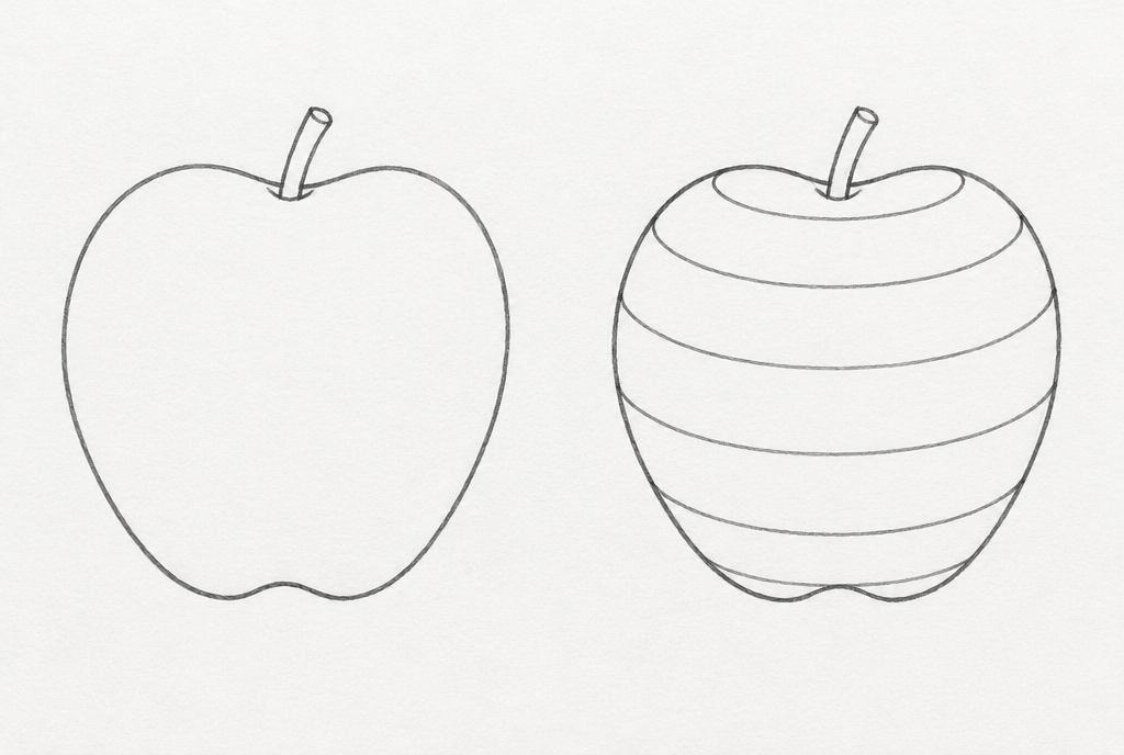
The outline apple is a cutout. The cross-contour apple is something you could pick up and take a bite of.
Try this (5 minutes): Draw a circle. Add curved lines across it, like the lines of latitude on a globe, so they bend around the surface. Watch your circle turn into a ball. Then try the same thing on your apple.
Where students get stuck: not following the cross-contours. Cross-contour lines are lines that travel around the surface of an object, not straight across it. When students draw straight lines across a round object, whether it’s stripes on a shirt or shading on a ball, the object instantly looks flat. If the object curves, your lines need to curve with it.
Space
Space is the area around, between and within things. Positive space is your subject. Negative space is everything around it. Space also covers the illusion of depth: making a flat page look like it goes back into the distance.
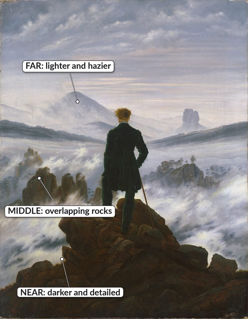
Artists have a few go-to tricks for showing depth:
- Overlapping: whatever is in front is closer.
- Size: things farther away look smaller.
- Placement: things higher on the page usually look farther away.
- Atmospheric perspective: things far away look lighter, bluer and less detailed, because we see them through more air.
In Wanderer above the Sea of Fog: Caspar David Friedrich painted this around 1818, and it’s a perfect lesson in space. The rocks the man is standing on are dark and full of detail. The rocky peaks in the middle overlap one another as they step back into the fog. The mountains far away are pale, hazy and almost the same color as the sky. That’s atmospheric perspective.
Mood switch:
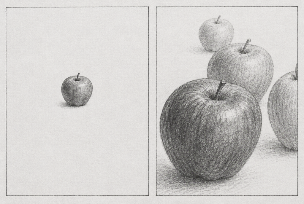
One small apple in lots of empty space feels quiet, maybe even lonely. Overlapping apples running off the page feel full, busy and close.
Try this (5 minutes): Draw three apples. Make one overlap another, draw one smaller and higher on the page, and let one run off the edge. Then make the farthest apple lighter and less detailed than the closest one.
Where students get stuck: three things.
- Nothing overlaps. Every object sits in its own little bubble, lined up in a row.
- Nothing touches the edge of the page. Letting something get cropped off the edge makes a composition feel bigger than the paper.
- Far things are as dark and detailed as close things. Without atmospheric perspective, everything sits on the same flat plane.
Value
Value is how light or dark something is. A value scale runs from the lightest light (usually the white of the paper) to the darkest dark your pencil can make, with grays in between. Value is what turns a flat circle into a ball, and it’s the backbone of almost everything else on this list. That’s why I always teach it before texture.
When light hits a round object, you’ll see a few parts:
- Highlight: the brightest spot, facing the light.
- Core shadow: the darkest part of the object itself, on the side turned away from the light.
- Reflected light: a slightly lighter area at the very edge of the shadow side, where light bounces back up from the table.
- Cast shadow: the shadow the object throws onto the surface next to it, on the opposite side from the light.
In The Basket of Apples: look back at Cézanne’s still life. The darkest dark is the wine bottle. The lightest lights are on the white tablecloth. And every apple has a light side and a shadow side, which is exactly what makes it look round. Value and form work as a team.
Mood switch:
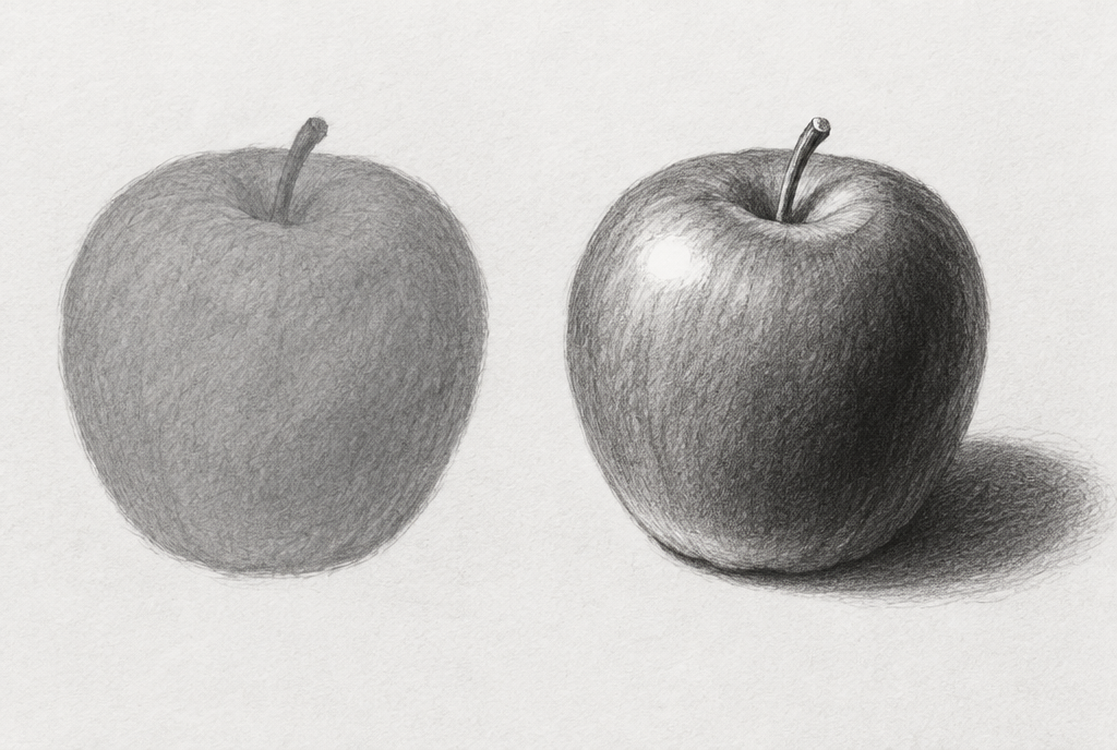
The all-gray apple feels foggy and dull. The high-contrast apple feels dramatic and real.
Try this (5 minutes): Make a five-step value scale, from white to your darkest dark. Then draw a circle, decide where the light is coming from, draw a little arrow to remind yourself, and shade it using all five values.
Where students get stuck: two big ones.
- Everything is a mid-tone. No darkest darks and no lightest lights, so the drawing looks flat and washed out. Don’t be afraid to press hard. Your darks are probably not dark enough…they almost never are at first.
- The lighting doesn’t make sense. The highlight and the cast shadow end up on the same side of the object, or students aren’t sure where the highlight, core shadow and cast shadow go. Here’s the rule of thumb: pick your light source first. The highlight faces the light. The core shadow and cast shadow fall on the side away from it.
For your next round of drawing practice try the Shading Practice Tool/Light Simulator on artteachertools.com.
Color
Color is what we see when light bounces off a surface and into our eyes. Every color has three properties:
- Hue: the color’s name, like red, blue-green or yellow-orange.
- Value: how light or dark it is. Add white for a tint; add black for a shade.
- Intensity: how bright or dull it is.
The color wheel shows how colors relate. Complementary colors sit across from each other and make each other pop. Analogous colors sit side by side and feel calm and connected. Warm colors (reds, oranges, yellows) feel energetic. Cool colors (blues, greens, purples) feel calm, or even sad.
In The Starry Night: Van Gogh built the painting around blue and yellow, a complementary pair. The yellow stars glow because they’re sitting in all that blue.
Mood switch:
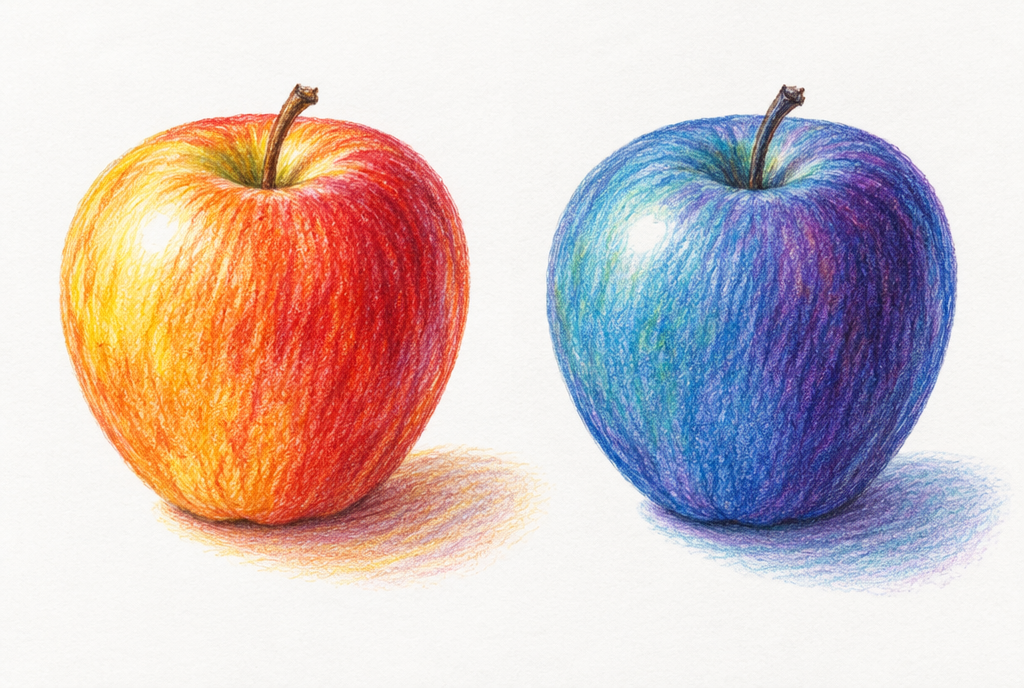
The warm apple looks fresh and cheerful. The cool apple feels moody, like it’s sitting in moonlight.
Try this (5 minutes): Before you color anything, pick a mood. Choose three colors that match it, make a small swatch of each, then color your apple using only those three.
Where students get stuck: two things.
- Overmixing. Keep stirring, and every color eventually turns to mud. Mix just until the color looks right, then stop.
- No color plan. Students grab whatever’s closest and throw any colors together without thinking about the mood those colors create. Decide how you want the viewer to feel first, then pick your colors.
Go deeper: my video lessons on color and the color wheel.


Texture: The Element That Trips Everyone Up
Texture is how a surface feels, or how it looks like it would feel. There are two kinds:
- Real (actual) texture is texture you can touch, like thick paint, collage, weaving or the surface of a sculpture.
- Implied (visual) texture is texture you can see but can’t feel. The page is flat, but your eyes are fooled into seeing fur, bark or shiny metal.
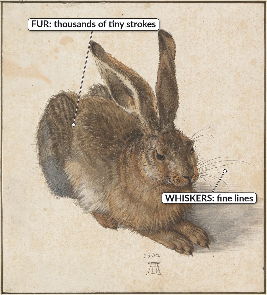
In Young Hare: Albrecht Dürer painted this hare in watercolor and gouache in 1502, and more than 500 years later it still looks soft enough to pet. Look closely and you’ll see why: the fur is made of thousands of tiny strokes, each one following the direction the hair grows. The paper is perfectly flat. That’s implied texture.
I cover both kinds, with lots of examples, in my texture video, so start there if texture is new to you:
This section is about the part most lessons skip: how to actually draw it.

Why texture is so hard
Of all seven elements, texture is the one my students struggle with most. Here’s why:
- There are so many kinds. Rough, smooth, fuzzy, shiny, bumpy, prickly, wrinkly…and every one of them is drawn a different way.
- It’s hard to know where to start. You look at a photo of tree bark and have no idea what to put down first.
- It’s a mood tool, not just a detail. Many students don’t realize that texture, or leaving it out, changes how a whole piece feels. Rough texture feels rugged or tense. Smooth texture feels calm and quiet. And leaving texture out is still a choice!
Mood switch:
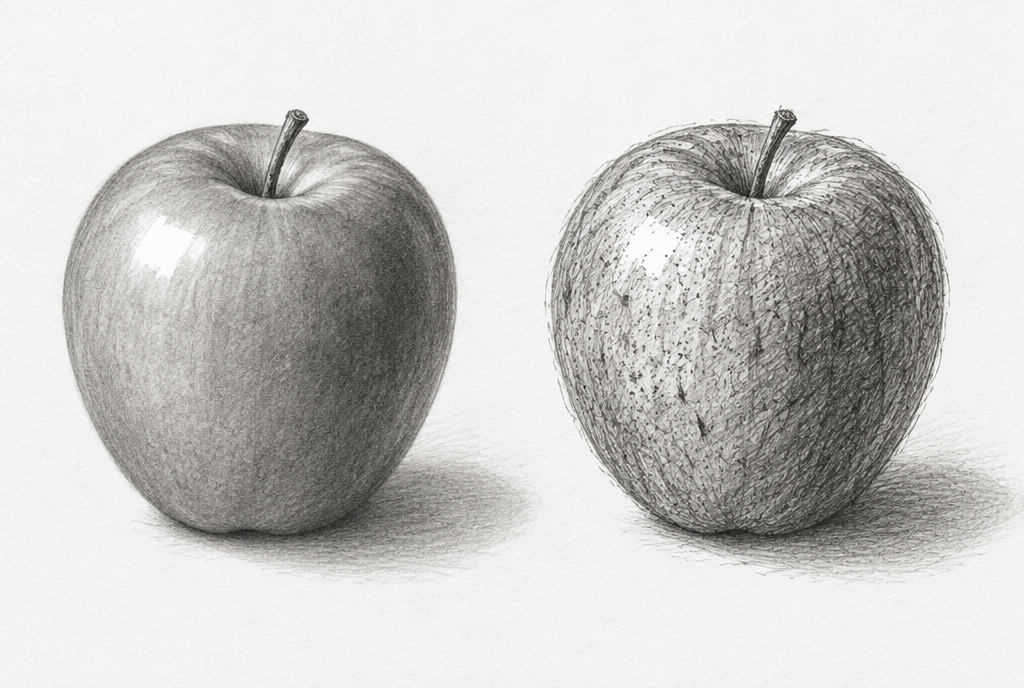
The smooth apple looks fresh and polished. The rough apple looks weathered, like it’s been through something.
How I Teach Texture in My Classroom
Here’s the order I use with my students, step by step. You can follow the same path at home.
- Value comes first. We don’t touch texture until we’ve practiced value and shading. Implied texture is really just light and dark in small doses: tiny highlights, tiny shadows, repeated over and over. If you can’t shade a ball yet, texture will feel impossible. Go back to the value section and practice that first.
- Define it and look at it. Before anyone draws, we talk about what texture is and look at lots of examples of it in art, both real and implied.
- The 12-texture worksheet. Students get a sheet with 12 photos of different textures, like tree bark, peeling paint and stone, with an empty thumbnail box next to each one. Using just a graphite pencil, they try to recreate each texture in its box. No color, no pressure, just looking and experimenting.
- Practice the hard ones together. Some textures are common but tricky, like hair. We work through those as a class, step by step, then students practice each one several times on their own.
- Then (and only then) use it in a project. By the time texture shows up in a finished piece, students have already drawn it more than once.
Get the free printable, 12-texture worksheet by clicking here.
Tips for Drawing Any Texture
- Look for the pattern of lights and darks, not the “thing.” Bark isn’t “bark.” It’s dark cracks, lighter ridges and a few highlights. Draw those.
- Let the texture follow the form. Remember cross-contours? Texture marks should wrap around an object the same way. Hair flows with the shape of the head; wood grain bends around a branch.
- Don’t draw the texture evenly everywhere. Put the most detail in the shadows and the parts closest to the viewer. Let it fade out where the light hits hardest.
- Use your pencil differently for different textures. Short, quick flicks for fur or grass. Dots (stippling) for sand and stone. Crisscrossing lines (cross-hatching) for rough cloth. Smooth blending plus a sharp, bright highlight for anything shiny.
Where students get stuck: two things.
- Drawing the texture the same everywhere. Even texture across a whole object makes it look like flat wallpaper instead of a real surface catching the light.
- Not knowing how to draw the texture at all. That’s exactly what the 12-texture worksheet is for. Matching your marks to a photo, one small box at a time, is how you build a toolbox of textures you can pull from later.
How the Elements Work Together
No element works alone. Look back at The Starry Night: the swirling lines carry the color across the sky, value makes the stars glow, and texture makes the whole thing feel alive. Change one element and the mood of the whole painting changes with it.
So how do artists decide how to arrange all seven? That’s where the principles of art and design come in: balance, contrast, emphasis, movement, pattern, rhythm and unity. If the elements are your tools, the principles are how you use them.
Free Texture Practice Worksheet
Want to try the same exercise my students do? Download the free 12-texture practice sheet: twelve texture photos, each with an empty box beside it. Grab a graphite pencil and see how many you can match.
Frequently Asked Questions
Are there 7 or 8 elements of art?
Most art teachers and museums teach seven: line, shape, form, space, value, color and texture. You’ll sometimes see pattern listed as an eighth. Many teachers, me included, treat pattern as a principle instead, because it’s about how you repeat the elements rather than a building block of its own.
What is the difference between shape and form?
Shape is flat (2D): a circle. Form is three-dimensional (3D): a ball. In a drawing, you turn a shape into a form with shading and cross-contour lines.
What’s the difference between the elements and principles of art?
The elements are the tools: line, shape, form, space, value, color and texture. The principles are how you arrange those tools in a piece, like balance, contrast and emphasis.
Which element should beginners learn first?
I always start out by teaching new artists about line, since it is the basic building block of everything that we will draw or paint in class. One more thing: Always learn value before texture. Texture is built out of value, so value makes everything else easier.
What is the hardest element of art to learn?
For most of my students, it’s texture. There are so many kinds, and each one is drawn differently. Practicing small texture thumbnails from photos is the fastest way I’ve found to build confidence.
Your Turn
“Art is not what you see, but what you make others see.” Edgar Degas.
Every artwork you’ve ever loved was built from these same seven tools. The only difference is how the artist chose to use them. So how will you use the elements in your next piece, and what will you make your viewer feel?
Tell me in the comments which element you find hardest. And if texture is the one giving you trouble, grab the free worksheet above and start with just one box. Trust me…that first box is the hardest one.
Leave a Reply