
Introduction
Color, as an essential element of art, plays a pivotal role in conveying emotions, setting the mood, and communicating ideas. Understanding color theory is crucial for artists, and one fundamental tool that aids in this understanding is the color wheel. In this article, we’ll delve into the basics of color theory, explore the significance of color in art and guide you through the process of creating your own color wheel.
The Basics of Color
Color is a powerful tool that can be symbolic or evoke emotions. It is a language that artists use to convey meaning and ideas. From the vibrant reds and yellows of Van Gogh’s “Starry Night” to the serene blues of Monet’s “Water Lilies,” artists use color to create a visual language. Colors can symbolize emotions, represent themes, and influence the viewer’s perception. For instance, warm colors like reds and yellows often evoke feelings of energy and passion, while cool colors like blues and greens convey calmness and tranquility.
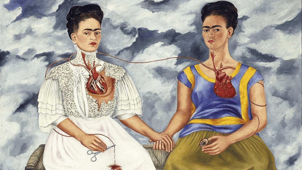
When we look at the work of Frida Kahlo, we see color being used to express pain, passion and resilience. Kahlo’s “The Two Fridas” employs a stark contrast of red and white dresses, symbolizing duality and self-reflection. Similarly, Picasso’s “The Weeping Woman” uses blue and green tones to convey sorrow and anguish. Understanding these nuances in color allows artists to infuse depth and meaning into their creations.
Color Theory and Its’ Significance
Color theory is the framework that artists use to understand how colors interact and complement each other. The color wheel, a visual representation of color relationships, is a fundamental tool in color theory. It was Sir Isaac Newton who first conceptualized the color wheel in the 17th century. The color wheel is essential for artists as it helps them create harmonious color schemes, explore contrasts, and achieve balance in their artwork. Whether you’re an art teacher guiding students or a homeschooling parent fostering creativity, understanding color theory lays the foundation for artistic expression.
Art teachers, for instance, utilize the color wheel to teach students about complementary colors, helping them create visually striking compositions. Professional artists, on the other hand, rely on the color wheel to experiment with various color schemes, achieving harmony or contrast based on their artistic intent. The color wheel is a versatile instrument, guiding artists in choosing colors that resonate with their themes and emotions.

Exploring Themes Through Color
Colors in art serve as a rich palette for artists to convey a spectrum of themes and emotions. Take, for instance, the iconic painting “The Scream” by Edvard Munch, where the bold use of swirling, frenetic colors such as reds and oranges heightens the sense of anxiety and existential dread. Munch’s deliberate choice of these intense hues transforms the canvas into a visual representation of inner turmoil. In contrast, Monet’s “Water Lilies” series masterfully employs cool blues and greens to evoke a serene and tranquil atmosphere. The soft, harmonious colors reflect the artist’s fascination with nature’s peaceful beauty.
As we continue examining how color plays a role in art themes, let’s consider Van Gogh’s Starry Night. We see vibrant swirls of blues and yellows that go past being simply representative, instead capturing the tumultuous emotions within the artist. The night sky becomes a kaleidoscope of emotions, each color contributing to the story. Artists consciously choose colors to evoke specific responses from the viewer, whether it’s the fiery reds of passion or the tranquil blues of serenity.
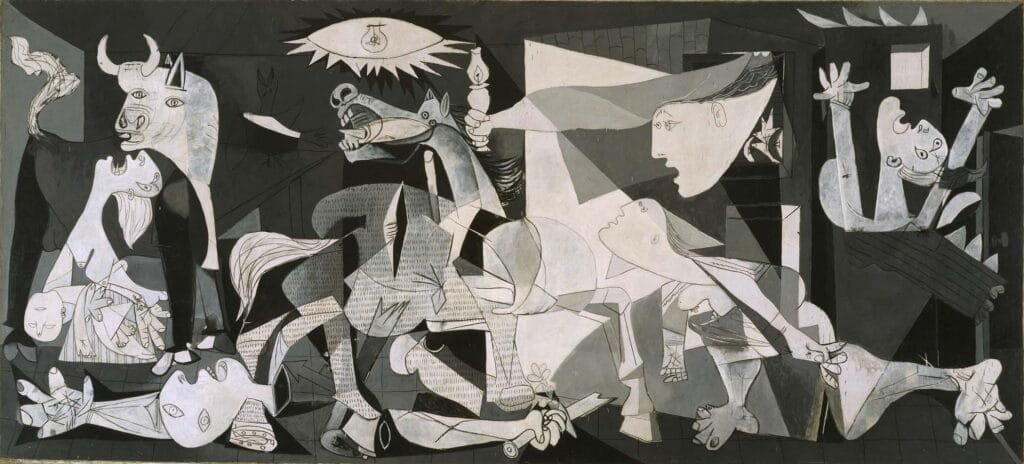
Picasso’s “Guernica,” a powerful anti-war statement, uses a monochromatic palette of black, white, and grays to amplify the somber and distressing subject matter. The absence of vibrant colors in this masterpiece intensifies the emotional impact, making it an evocative commentary on the horrors of war. Artists like these strategically manipulate color to provoke specific emotional responses, providing viewers with a profound and immersive experience.
Real-World Application of Color
Beyond the canvas, color is a tool with practical applications in various real-world contexts. In architecture, color choices impact the mood and functionality of spaces. Warm tones like reds and yellows create an inviting atmosphere in living spaces, while cool blues enhance concentration in workspaces. Graphic designers leverage color psychology in branding, choosing hues that resonate with target audiences and convey brand messages effectively. Understanding color theory equips professionals in diverse fields to make intentional and impactful color decisions.
Creating Your Own Color Wheel
Now, let’s explore the step-by-step process of crafting your own color wheel. For this project you will need the following art supplies: paper, primay color paints, a paint brush, a cup of clean water (for washing your brush between colors), a ruler and a pencil. A compass or something round that you can trace would also be helpful when it’s time to draw your circle.
Begin your color wheel by drawing a circle. Divide the circle into four equal sections by drawing a vertical and a horizontal line inside of it. Next we will take each of those four sections and divide them into three slices. You should end up with a 12-section color wheel (each quadrant of the circle becomes three sections). Use your ruler as you draw out these lines to keep everything looking nice and neat.
Each of these sections represent our primary colors (red, blue, yellow), secondary colors (green, orange, purple), and tertiary colors. Paint in your primary colors first. They are spaced every fourth slice (leaving 3 empty spaces between each primary color). Next, mix your primary colors to make your secondary colors. You will place each secondary color between the primary colors you used to mix them. For example, orange is put in the middle between red and yellow. Be sure to leave an empty space on both sides of your secondary colors. Finally, you will paint in the tertiary (sometimes called intermediate) colors. These will also be place in between the two colors that were mixed to make them. And that’s it! You should have a beautiful color wheel completed.
Use your color wheel to explore the relationships between colors. Try out complementary, analogous, and triadic color schemes. As you mix and match colors on your wheel, observe the harmony and balance that different combinations create.
Need a visual? Watch my “How to Paint a Color Wheel” video on YouTube for a step-by-step tutorial video.

Conclusion
In the expansive realm of art, mastering color theory is an ongoing journey that transcends skill levels. Whether you’re an art teacher shaping young minds or a homeschooling parent nurturing creativity, the depth of understanding color offers is unparalleled. From the symbolic narratives in Kahlo’s paintings to the emotional turbulence in Van Gogh’s masterpieces, color is a language that artists fluently speak. By painting your own color wheel and delving into the intricacies of color theory, you empower yourself to wield color with purpose and precision, elevating your artistic expression to new heights.So, dive into the world of color, experiment with your own color wheel, and let your creativity flourish.
Leave a Reply